
Branding the City of Ridgefield, Washington
Uniting past and future with a brand the whole city can stand behind
Client: City of Ridgefield, WA
Year: 2015 – Present
Scope: Brand strategy, messaging, logo design, visual identity, typography, color system, website design and development, vehicle graphics, street banners, print collateral, templates, staff training

The Challenge
In 2015, Ridgefield was one of the fastest-growing cities in Washington. But its identity had not kept pace with its momentum. The City needed a cohesive brand that could unite longtime residents and new arrivals, reflect its character, and stand out in a crowded regional landscape.
This was not just about designing a logo. The goal was to build a complete brand system that included strategy, messaging, visual identity, and a thoughtful rollout plan that would work across every department and platform.
The Process
The project was organized into three phases: research and engagement, design, and implementation. Each step was built on collaboration, clarity, and a long-term vision.
Phase 1: Research and Engagement
We began by forming a diverse advisory panel that included city staff, business owners, educators, and residents. Through a series of workshops, we explored Ridgefield’s points of distinction, reputation, aspirations, and challenges.
To ensure the process was grounded in data, we identified proof points to support Ridgefield’s strengths and emerging identity. These included real-world examples, community data, and specific indicators that validated how the city was seen and where it was headed.
A key insight was the presence of two very different groups of residents. On one side were lifelong locals who valued Ridgefield’s history and were cautious about change. On the other were younger, forward-thinking families seeking a safe, close-knit, and vibrant rural community where they could grow. The brand needed to speak to both — honoring the past while creating space for the future.
We also examined how Ridgefield compared to neighboring cities and clarified its tone of voice, values, and position in the region.
Phase 2: Design
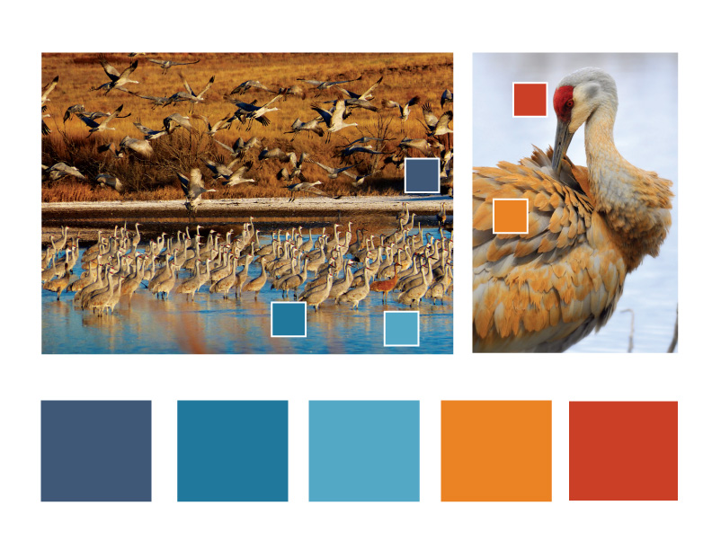
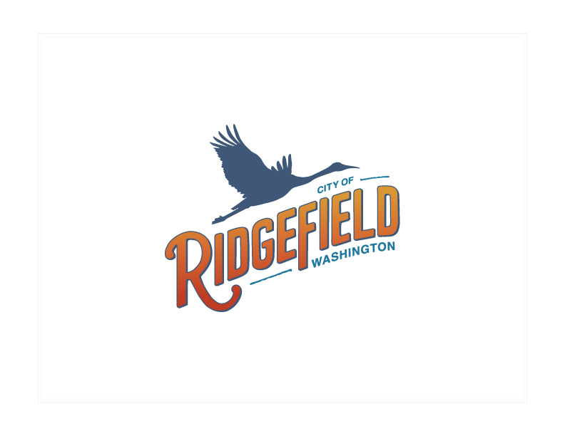
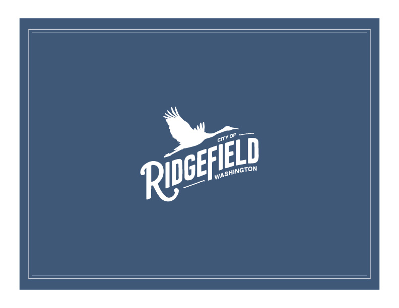
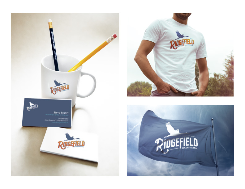
With a clear foundation in place, I created a full brand identity system. This included a new logo, color palette, typography, and visual language that reflected Ridgefield’s natural beauty, small-town roots, and forward momentum.
Throughout the process, I presented key creative concepts to the City Council and City Manager to build support and ensure alignment. Their enthusiasm helped drive momentum and made implementation smoother across departments.
The final identity was designed to be flexible and timeless — a system that could grow with the city and support a wide range of materials, from digital platforms to print collateral and signage.
Phase 3: Implementation
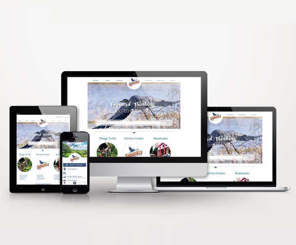
Once the new identity was approved, we rolled it out across key platforms. I designed and developed the city’s new website, creating a seamless experience that stayed true to the brand system. I also trained city staff on how to manage and update the site in-house.
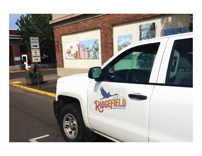
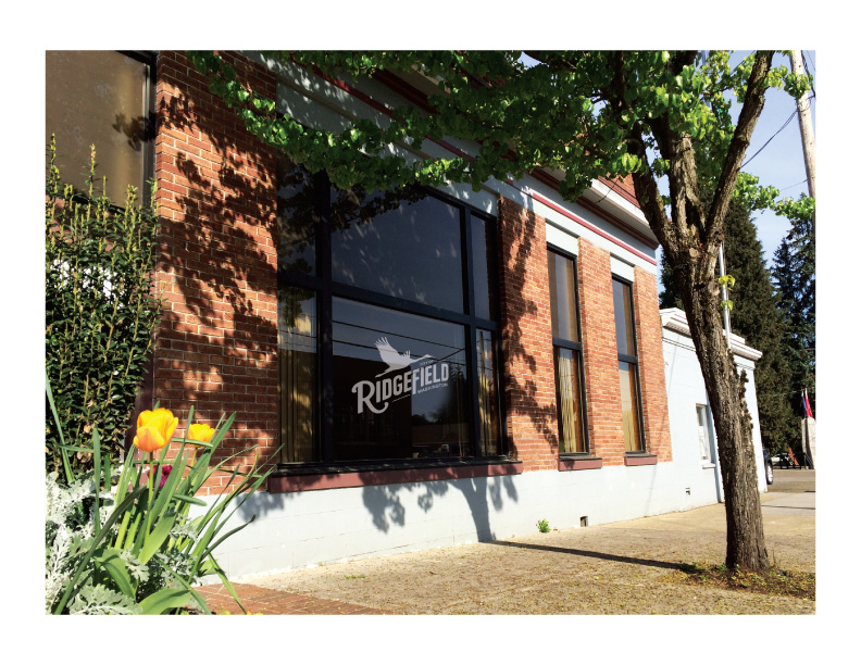
To support internal consistency, I developed branded templates for presentations, announcements, and outreach materials. The identity was also applied to vehicle graphics, street banners, public documents, and signage.
The implementation was smooth and well received, giving the City the tools to communicate clearly, consistently, and with pride.
The Results
When this project began, Ridgefield was a small city of fewer than 7,000 people. Today, it is home to more than 15,000 and continues to grow.
Ten years later, the brand is stronger than ever. Ridgefield has seen a sharp rise in population and revenue. The City is investing heavily in infrastructure and public facilities and attracting major retailers, employers, and new residents from across the country.
But the most meaningful result? Pride. Ridgefield’s new brand gave the City a voice and visual identity the community could stand behind. It helped unite departments, leaders, and residents around a shared story and created new opportunities to connect with the public in more consistent, engaging ways.
The rebrand gave Ridgefield more than a visual update. It provided a clear, authentic foundation for growth, communication, and civic pride that continues to deliver value year after year.
A Lasting Partnership
The work didn’t end with the rebrand. Since the launch, I’ve continued to support the City of Ridgefield with a wide range of design and branding needs that keep the identity fresh, consistent, and relevant.
From event branding and marketing to newsletters, direct mail, murals, and historical plaques, I help the City show up with clarity and creativity across every touchpoint. I’ve also led branding efforts for the Historic Downtown District and supported the communication of Ridgefield’s ongoing growth and investment.
The City continues to trust me as a creative partner—someone who understands the brand from the inside out and can help maintain its integrity as the community evolves.
If you’re ready to shape a brand your community can rally behind, I’d love to help. Reach out and let’s start a conversation.